Why Every World Map You've Ever Read Is Wrong
If you've ever glanced at a world map, whether in a classroom, a textbook, or on Google Maps, you've likely been looking at a version of the **Mercator projection**. It's the most ubiquitous map in t
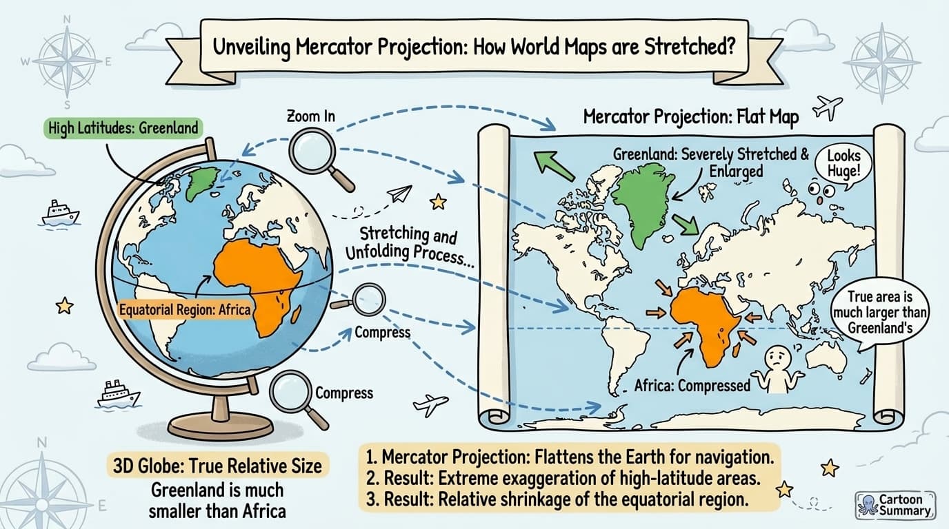
If you've ever glanced at a world map, whether in a classroom, a textbook, or on Google Maps, you've likely been looking at a version of the Mercator projection. It's the most ubiquitous map in the world, but it carries a fascinating and significant flaw: it dramatically distorts the size of countries.
The Greenland Problem: A Visual Lie
The most famous example of this distortion is the comparison between Greenland and Africa. On a Mercator map, Greenland appears to be a massive, sprawling landmass, roughly the same size as the entire African continent.
But this is a cartographic illusion.
In reality, Africa is 14 times larger than Greenland. Africa covers about 30.4 million square kilometers, while Greenland is a mere 2.16 million square kilometers. The Mercator projection, created in 1569 by Gerardus Mercator, was designed for nautical navigation. Its strength is that it preserves angles, meaning a straight line on the map is a line of constant compass bearing. This was revolutionary for sailors.
However, to achieve this, the map stretches out the areas near the poles. The further you get from the equator, the more exaggerated the size of the landmasses become.
Beyond Mercator: Other Ways to See the World
No flat map can perfectly represent a spherical Earth, but other projections prioritize showing land area mulher accurately. The Gall-Peters projection, for instance, is an equal-area projection. It shows countries in their correct relative sizes, but it distorts their shape.
Looking at a Gall-Peters map, you immediately notice how elongated the continents look, but you also see the true, immense scale of Africa and South America, and how relatively small Europe and North America are.
Conclusion: The Right Tool for the Job
There is no single “perfect” map. The Mercator projection is an excellent tool for navigation, but a poor one for understanding the true scale of our world. The Gall-Peters projection gives us accurate size, but at the cost of shape.
Ultimately, the best map is the one that best serves its specific purpose. And for truly grasping the size of countries, nothing beats an interactive tool.
Ready to see the world differently? Drag and drop countries on true-size.com and discover their real proportions.