Europe’s Actual Area: A Cartographic Perspective on Continental Perceptions
How map projections distort our perception of Europe’s size, and how true-size comparisons make continental scale easier to judge.
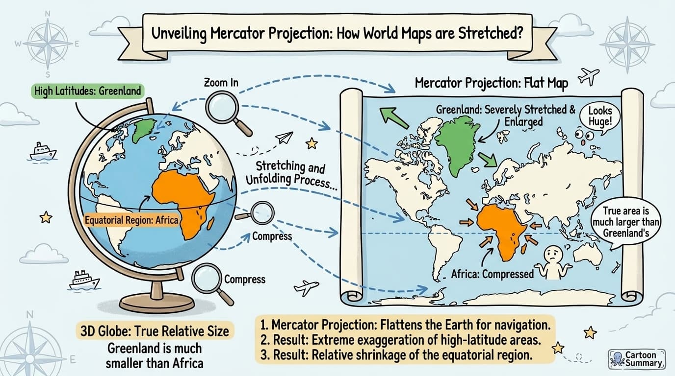
Flat maps always involve trade-offs. This article explains how those trade-offs affect our perception of Europe’s size and how a true-size comparison can make continental scale easier to judge.
The Map Projection Dilemma: Why All Flat Maps Lie
The most widely used world map for centuries has been the Mercator projection, created by European cartographer G. Mercator in 1569. While excellent for navigation because it preserves angles and directions, this projection severely distorts sizes, particularly at higher latitudes.
The Mercator effect on European perception:
- Greenland appears comparable in size to Africa on Mercator maps, when in reality Africa's area is 14 times larger
- Scandinavian countries appear disproportionately large compared to their actual size
- Central European nations seem smaller relative to their northern counterparts
- Russia appears massive, stretching across what seems to be half the continent
This distortion has led to what some critics call "Eurocentric cartographic bias" – making European nations appear larger relative to tropical regions than they actually are.
Quantifying the Distortion: Europe's True Scale
When we adjust for projection distortions, we discover that Europe's geographical reality differs significantly from its mapped appearance:
"If we want to compare areas on a map, the proportions of various countries should maintain the same ratio as their actual territories, but this inevitably distorts shapes and distances."
The following table illustrates how selected European countries appear larger on Mercator projections than their actual size relative to other global regions:
| Country | Apparent Size on Mercator | True Relative Size Comparison |
|---|---|---|
| Greenland | Comparable to Africa | Actually smaller than India |
| Sweden | Larger than India | Approximately 1/3 India's size |
| Germany | Appears substantial | Could fit multiple times into Argentina |
| United Kingdom | Seems prominent | Smaller than Madagascar |
Comparing Europe at a Consistent Scale
A map becomes easier to interpret when the areas being compared use the same scale and projection context. Instead of relying on a familiar atlas layout, compare outlines directly and check the area basis behind the result.
What a True-Size Comparison Can Show
A true-size comparison helps separate land area from the visual cues that often shape intuition. It lets readers:
- Compare land areas without relying on the apparent size of a map projection
- See how latitude changes visual impressions of countries and regions
- Distinguish geographic footprint from population, politics, or map placement
Use Area Data Alongside the Map
An overlay is most useful when paired with a clearly defined area measure. Geographic entities can be counted differently depending on whether a source uses total area, land area, or overseas territories, so a comparison should state its basis before drawing conclusions.
The Political Dimensions of Cartographic Representation
Map projections are never neutral technical choices; they embody cultural perspectives and political values.
Historical context of European map dominance:
- Mercator projection placed Europe at the center of the world map
- Terms like "Near East," "Middle East," and "Far East" emerged from this Eurocentric perspective
- During the Cold War, both sides maintained Mercator projections because it exaggerated the size of the Soviet Union, serving both Western fears and Soviet propaganda
Alternative projections like the Peters projection (actually developed by James Gall in 1855) offer more accurate area representation, but have faced political resistance because they diminish the apparent size of Northern hemisphere nations.
Practical Ways to Read Europe’s Scale
When comparing Europe with another region, use these checks:
- Combine multiple perspectives: Use equal-area projections for size comparison, but recognize their own distortions
- Check the area basis: Confirm whether a source uses land area, total area, or a defined continent-level boundary
- Use an interactive overlay: True Size lets you compare country outlines directly at a consistent scale
- Keep distance and area separate: A region can feel close or far in travel terms without being large or small in area
Conclusion: Toward a More Accurate European Geography
The distortion of Europe on world maps represents both a technical challenge in cartography and a cultural phenomenon in perception. While no flat map can perfectly represent our spherical planet, awareness of these distortions helps develop a more accurate mental geography.
The most useful way to understand Europe’s scale is to combine a clear area definition with a comparison that does not depend on a single familiar map layout.