Russia vs. Africa: A Surprising True Size Comparison
Here’s a question that stumps most people: which is bigger, Russia or the continent of Africa? Looking at a standard world map, it’s an easy mistake to make. The Mercator projection, used by Google
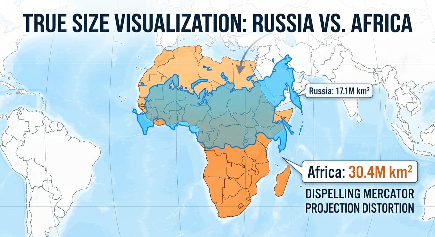
Here’s a question that stumps most people: which is bigger, Russia or the continent of Africa?
Looking at a standard world map, it’s an easy mistake to make. The Mercator projection, used by Google Maps and in most classrooms, depicts Russia as a colossal giant, appearing to dwarf Africa.
But what happens when we correct for this distortion?
The Truth Revealed
Using the interactive map on true-size.com, we can drag Russia down to the equator and place it over Africa. The result is staggering.
When compared accurately, the African continent is far larger than Russia.
Africa is not just bigger than Russia; it's vastly larger. Here are the hard numbers:
| Region | Area (Million km²) |
|---|---|
| Africa | 30.4 |
| Russia | 17.1 |
That's right. You could fit Russia into Africa with enough room left over for another India. Africa is so large that it could comfortably contain the USA, China, India, Japan, and most of Europe combined.
Why Our Perception is Skewed
The Mercator map was never intended to be a tool for comparing land area. Its purpose was to aid navigation at sea. However, its widespread use has had a profound, often unconscious, impact on our perception of the world. It inflates the size and perceived importance of nations in the Northern Hemisphere while diminishing those nearer the equator.
This isn't just a matter of trivia. Understanding the true size of continents and countries is fundamental to grasping global demographics, economies, and cultures. When we see Africa for its true, immense size, we can better appreciate its incredible diversity and significance on the world stage.
Think your geographic intuition is sharp? Try our country size quiz and see how you score!